Abby Cracraft
Abby Cracraft
The Lovesick Tour: Live Album
The Lovesick Tour: Live Album
The Lovesick Tour: Live Album
Album Cover / Branding
Album Cover / Branding


PROJECT OVERVIEW
PROJECT OVERVIEW
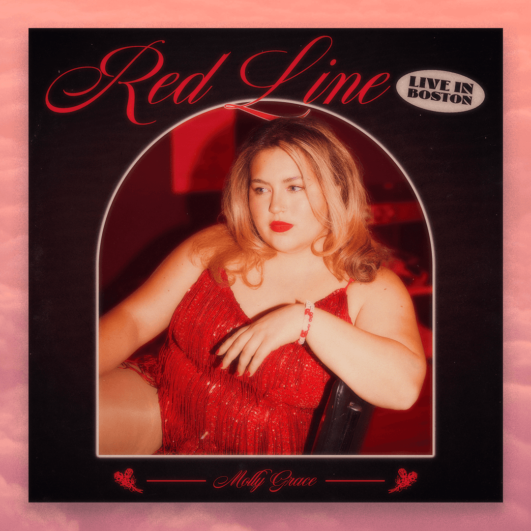
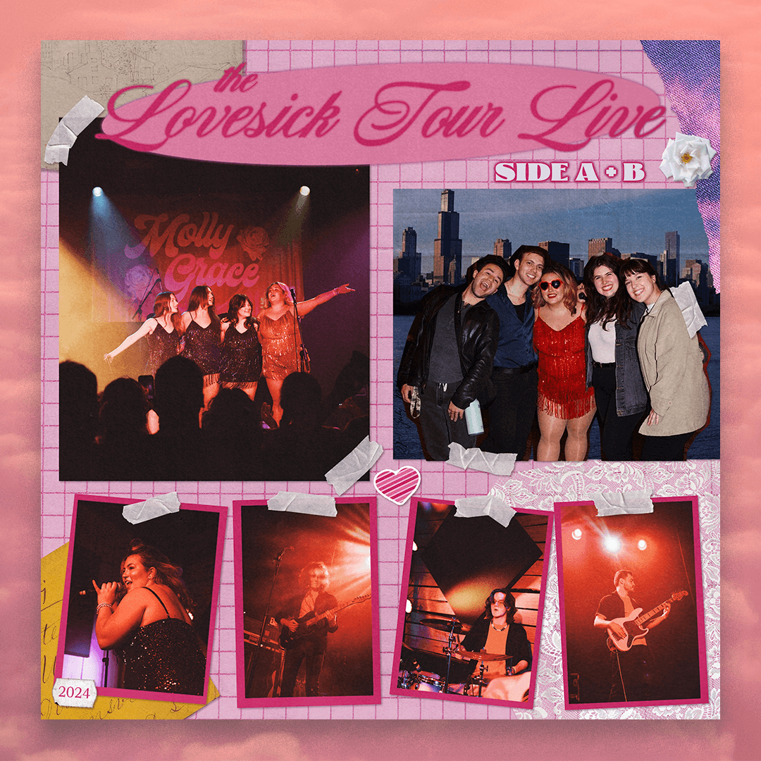
Designing for an artist who has captured such an iconic space within the music industry requires a deep understanding of their personal brand and image. For Molly Grace's album "The Lovesick Tour: Live", her team approached for not only the main design for "Side A+B" but also for two singles and a "Side A" version.
Using photos from photographer Bella Sgarlata (Bella Rose Media) I focused solely on Molly Grace for the two singles, "Little Bit of Hell (Live in New York)" and "Red Line (Live in Boston)", and a textured background. No one gives off more feminine energy than Molly, so focusing in on feminine imagery with flowers, a script font, hues of pink/red, and an overall tinge of retro helped bring these designs to life.
As for the "The Lovesick Tour: Live Side A" and "Side A+B", it was clear that due to the number of photos that showed Molly with her community of fans, that a collage styled cover would be fitting. For many fans of her, they love her music as much as they love the community she has given to them and that was the inspiration of keeping them front and center.
DESIGN CONCEPT
DESIGN CONCEPT


